Unqork built a robust and flexible design system for an enterprise no-code platform. Here’s how they did it.
In order to iterate with confidence and deliver products at scale, teams need a single source of truth—commonly known as a design system. Yet these systems are more than just reusable UI components; they are living ecosystems unified by a shared language—and are essential in order to streamline product development.
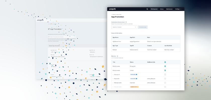
When it came to building a design system for Unqork, their internal Platform UI team had a unique challenge: updating the design and front-end code without disrupting the current experience customers were using—while continuing to deliver on new innovative features to remain a leader in the market.
Let’s walk through how they took on this vital challenge.
Building a design system in hyper-growth
The ultimate goal of this system was to provide a world-class user experience to the platform. This could only be done by ensuring designers and engineers have the tools, assets, and documentation that enable them to work with greater efficiency, consistency, and ease. The new system aimed to bridge communication gaps and increase velocity, while also elevating the platform experience via a unified tech stack, cohesive styling, and consistent UX.
Unqork worked with the design agency Free Association to first help the team audit the platform, formulate a design strategy, create design principles, and eventually build the initial infrastructure for the Figma library. They started with a discovery phase that included an inventory of existing components and their current functional requirements, documenting how each was used and which states or functionalities were needed to deliver a minimum viable product (MVP).
Watch the replay of our recent Unqork Create session: “How to Build a World-Class Design System”
Implementing cross-platform
With the journey ahead signaling some significant product updates, the Platform UI team faced the interesting challenge of “how do we roll this out so we can deliver value as soon as possible?” Naturally, they could not stop feature development and also rebuild every feature in the platform if they were going to pull this off. “Plus, a completely frankenstein platform with all sorts of contrasting colors, technologies, and UX patterns would do more harm than good,” says Unqork’s product lead, Michael Furst.
“We met with feature teams to figure out how to accomplish this in a way that would add value to their roadmap. The solution that would ultimately be fastest for our engineers and cause the least disruption to our Creators would be to implement our design system by feature area.”
Principles for building an MVP
An overarching Principle was to think from a “current state” perspective, making sure components were not over-engineered while keeping them future-proof. To deliver on an MVP design system in the most efficient way possible, the process was centered around building what was needed today, and then iterating later as new use cases became necessary.
With this strategy in mind, the team established some key foundational principles that aimed to guide and inform the many product, design, and engineering decisions ahead of them. The Platform UI team built their first batch of most frequently used components with baseline functionality needed for today’s discovered use cases.
1. Adaptable: Flexible; modular; designed to evolve over time; future-proof
2. Dynamic: Durable & effective; agnostic to particular patterns; compose to create complexity
3. Intentional: Purpose and utility drive decisions; everything for a reason
4. Cohesive: Strength through shared understanding, communication, and clarity

One library to rule them all
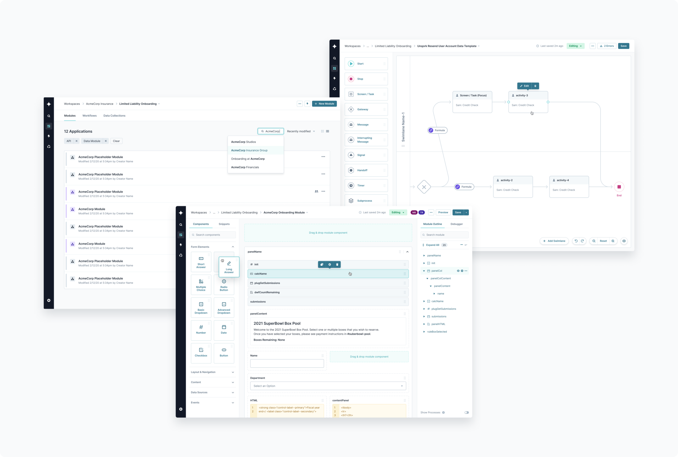
For engineering, this meant migrating to a single front-end library using React, giving feature teams a consistent developer experience.
Before the design system, there were multiple frameworks and libraries being used. Engineers would sometimes have to rebuild the same component in each of the frameworks and that also meant constant context switching, which was less than ideal.
Moving to this single library, feature teams could now focus on what mattered most: delivering features to customers, as they could easily import each component they needed and rely on the fact it was built to specification.
To make sure those components always stayed to spec, Platform UI wrote unit tests with 100% code coverage and created a visual regression setup utilizing Applitools and Storybook. Sparked from seeing designers build out all possible variations and states a component could have in Figma, the team recreated these using React versions of the components inside Storybook and used Applitools Eyes to be notified if anything went awry.

Library architecture
From a design perspective, the team looked at how they could set up the library architecture so that it also could scale as the product evolves. Creating shared Libraries in Figma, they organized the setup into: 1. Tokens (foundations), 2. Brand Components (base UI), 3. Local Components (feature-specific)

Tokens refer to the baseline properties that are used everywhere across the product (e.g., color, typography, icons, spacing). Designers compile these atoms together to create UI elements that can flex across multiple feature areas (e.g., Button, TextInput, Checkbox)—called Brand Components. Other elements that are built uniquely for a single feature area are referred to as Local Components and are only used in exclusive situations—in alignment with our agreed upon principles.
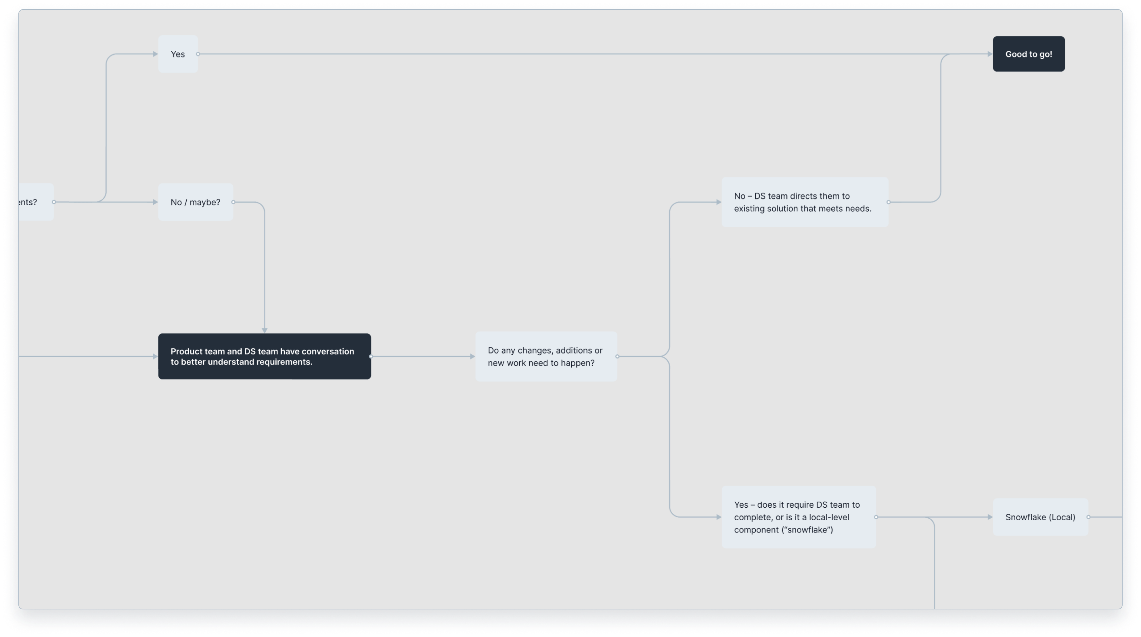
Rather than trying to create a single, all-comprehensive library for the entire platform, the team instead chose to focus on a foundational set of UI that was flexible enough to be used anywhere across the product—before building any specific local-level library components.

Of course as feature teams design and build, there could be instances when brand-level components don’t provide the best solution. For this, the team follows a process that allows for potential components to be explored, proposed, reviewed, and potentially added to the libraries. This ensures the design system is being used diligently, but also keeps the doors open for more creative and elegant solutions.
Leveraging the power of Figma
Unqork used Figma to initially build their UI library, which has proven to be an eye-opening experience after migrating from other design programs. They continue to keep up with the tool in order to leverage the latest capabilities, and have recently refactored their original libraries to take advantage of some powerful features (e.g., Auto-Layout, Variants). Doing so has drastically improved how designers craft their UI, and has provided crucial enhancements for efficiency, usability, and transparency.
With Auto-Layout, designers can now build UI with a structure that dynamically adapts to contextual changes. This allows for responsive behavior while in design, and creates a flexible structure that expands and shifts with its content.
With Variants, designers can now effortlessly adjust component overrides without having to navigate multiple nested folders to find the exact variant—providing an intuitive way to stay focused on more complicated solutions. Both features are game changers having raised the bar for all advanced design systems—and Unqork’s is no exception!
Conclusion
As you can see, actually creating a design system is a complex beast. In order to be successful, it requires a huge amount of cross-discipline focus to not only design, build, and implement—but also govern and maintain the system over time. It’s a living organism that needs dedicated care in order for it to thrive in its environment, which means it’s ever-evolving and should always be a work in progress.
That said, Unqork has certainly accomplished their initial goal of creating a top-tier design system. With a solid foundation in their approach, they are now well-equipped to evolve as the product continues to grow. By making the investment to solve for visual, UX, and technical concerns cohesively from the ground up, Unqork was able to build a robust and flexible design system that now drives their product development forward as the platform continues to scale. This is just the beginning!
The Unqork Design System is currently being implemented in phases across feature areas. Unqork’s very own Michael Furst (product lead), Ryan Lasswell (design lead), Philip Bordallo (engineer lead), and Julie Wongbandue (engineer) will take a deeper dive into how they built this world-class design system at Unqork Create (Oct 12–14). Click here to register for the virtual event.
You Might Also Be Interested in